
Field Advanced 3 component design & features
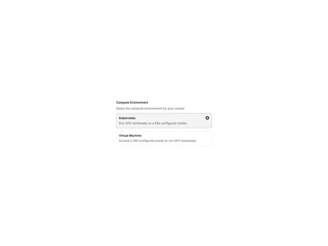
This example builds RadioGroup options as horizontal Field blocks with FieldContent, FieldTitle, FieldDescription, and RadioGroupItem inside FieldLabel wrappers. Users pick one card-style option from a set.
Choice cards fit plan comparison, deployment target selection, and onboarding paths where each option needs a title and paragraph. They expose more context than compact radio lists.