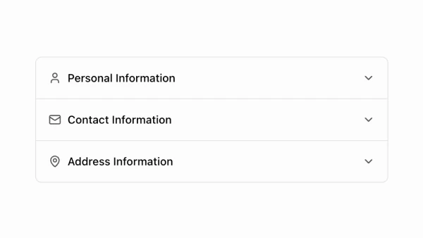
Shadcn Accordion Components

Browse our collection of 21+ Shadcn Accordion components. These Shadcn UI Component variants extend the Accordion component and are built with React, Typescript and Tailwind CSS. The component code can be installed via the shadcn cli or simply copy & paste it directly into your codebase and customize as needed.

Shadcn UI Accordion Components

A React accordion component for creating collapsible content sections. Built with TypeScript and Tailwind CSS, featuring full keyboard navigation support and accessibility compliance.

Why Accordions Matter

Accordions aren’t just about saving screen space—they’re about giving users control over their information consumption. Instead of overwhelming visitors with everything at once, accordions let them focus on what’s relevant to their needs.

Think of accordions as interactive table of contents—users quickly scan headers, identify what they need, and expand only those sections. This approach creates a cleaner, more scannable interface that works especially well on mobile devices where screen real estate is precious.

Built on Radix UI primitives, our accordion components follow WAI-ARIA design patterns. Keyboard navigation, screen reader support, and proper focus management work out of the box—no additional configuration required.

Common Use Cases

  • FAQ sections - Organize frequently asked questions in an easy-to-scan format
  • Product features - Showcase detailed feature descriptions without overwhelming users
  • Documentation - Create collapsible sections for technical docs and guides
  • Settings panels - Group related configuration options with multiple expansion support
  • Mobile navigation - Implement collapsible menu sections for compact interfaces
  • Content organization - Break down long-form content into digestible sections

Component Capabilities

The accordion component includes everything you need for production-ready implementations:

  • Complete keyboard support - Arrow keys, Space, Enter, Home, and End keys all work seamlessly
  • Dual expansion modes - Single or multiple items can be open simultaneously
  • State management flexibility - Use with React state management or let the component handle its own state
  • Smooth animations - CSS variables for content height/width enable smooth transitions
  • Built-in accessibility - WAI-ARIA compliant with proper focus management and screen reader support
  • TypeScript support - Built with TypeScript, works perfectly in JavaScript projects too

Component Props

PropTypeDefaultDescription
type”single” | “multiple""single”Determines if one or multiple items can be expanded at a time
collapsiblebooleanfalseAllows collapsing the currently expanded item when type is “single”
defaultValuestring | string[]undefinedThe default expanded item(s) for uncontrolled usage
valuestring | string[]undefinedThe controlled expanded item(s) for state management
onValueChange(value: string | string[]) => voidundefinedCallback function when the expanded item(s) change

Keyboard Shortcuts

Built on Radix UI, the accordion supports comprehensive keyboard navigation:

KeyDescription
Space / EnterToggles the focused accordion item
TabMoves focus to next focusable element
Shift + TabMoves focus to previous focusable element
ArrowDownMoves focus to next accordion trigger
ArrowUpMoves focus to previous accordion trigger
HomeMoves focus to first accordion trigger
EndMoves focus to last accordion trigger

Implementation Guidelines

Initial state impacts user experience. For FAQ pages, keep all items collapsed by default—let users choose what to expand. For dashboards or settings panels, consider opening the most important section by default to guide users.

Headers need quick scanning. Use concise, descriptive labels like “Payment & Billing” rather than verbose descriptions. Users need to scan quickly, so make headers work like a table of contents.

Verify keyboard behavior. Arrow keys should move between triggers, Space/Enter should toggle items. The component handles focus management automatically, but custom implementations need careful testing.

Optimize for performance. The component is lightweight and works great in TypeScript projects. Tailwind CSS styling keeps bundle sizes small while maintaining full customization capabilities.

Integration Notes

Accordions work seamlessly with other shadcn/ui components. Combine with Form components for organizing complex interfaces, use Badge components to show status or counts in trigger headers, and integrate Lucide React icons for visual hierarchy. The design system makes these integrations smooth across JavaScript and TypeScript applications.