Shadcn UI Popover Examples
Popover components display floating content panels that appear on trigger interaction, similar to tooltips but with richer content and interactive elements. They appear throughout interfaces for contextual actions, additional information, and compact content display.
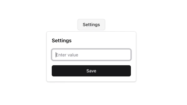
These blocks show popovers with various positioning options, close buttons, and interactive content. Examples include popovers with forms, popovers with action buttons, and popovers with rich content like calendars or color pickers.
Shadcn popover examples cover the most common patterns: action popovers, content popovers, and form popovers. Browse our blocks to find the configuration you need.
