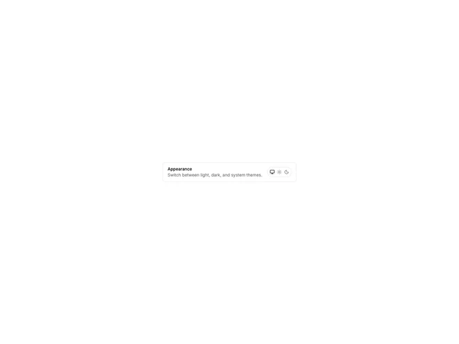
Shadcn UI Theme Switcher Components
Shadcn theme switcher components are reusable UI primitives from shadcn/ui. Browse ready-to-use components showing variants, states, and compositions you can drop into forms, dashboards, and marketing pages.
Each component is self-contained React code you can copy and paste into your app. Install the shadcn/ui primitive with the CLI, then customize layout, styling, and behavior to match your product.
The collection covers default and variant styles, sizing, disabled states, form integration, and compositions with related shadcn/ui primitives — plus practical examples and UI patterns for common theme switcher use cases. Each component is built with React, Tailwind CSS, and accessible Radix UI or Base UI.
Frequently Asked Questions
How are Shadcnblocks theme switcher components built?
Shadcnblocks theme switcher components are built with React, Tailwind CSS, and shadcn/ui primitives.
What technologies are used to build Shadcnblocks theme switcher components?
Each component uses standard React, Tailwind utility classes, and shadcn/ui primitives from the official registry.
What frameworks do Shadcnblocks theme switcher components work with?
Shadcnblocks theme switcher components work with any React-based framework including Next.js, Remix, Astro, and Vite.
Can I customize Shadcnblocks theme switcher components?
Yes. Every component is source code you add directly to your project. You can modify markup, styling, and behavior using standard React and Tailwind.
Do Shadcnblocks theme switcher components support dark mode?
Yes. Components use shadcn/ui’s theming system and support light and dark mode out of the box.
How do I install the theme switcher component?
Install the base shadcn/ui component with the CLI: npx shadcn add theme-switcher. Then copy any Shadcnblocks theme switcher component you need from the library.
Can I copy and paste the code into my project?
Yes. Open any component page and use the code tab to copy the full source into your project.