Shadcn List Panel Basic Components

Browse and download 28+ Shadcn UI List Panel Basic components. Built with React, Tailwind and shadcn/ui. These shadcn components are ready to download, copy and paste or install with the shadcn registry.

Basic vertical stack of Item rows with titles only.

List rows stacked flush inside one bordered panel with divide lines between entries.

Stacked outline rows that share edges inside one rounded group.

Dense list using Item size sm for tighter row spacing.

List grouped inside a single rounded border container.

Ordered list with a rank column prefix on every row.

Two-line rows with ItemTitle and ItemDescription on every entry.

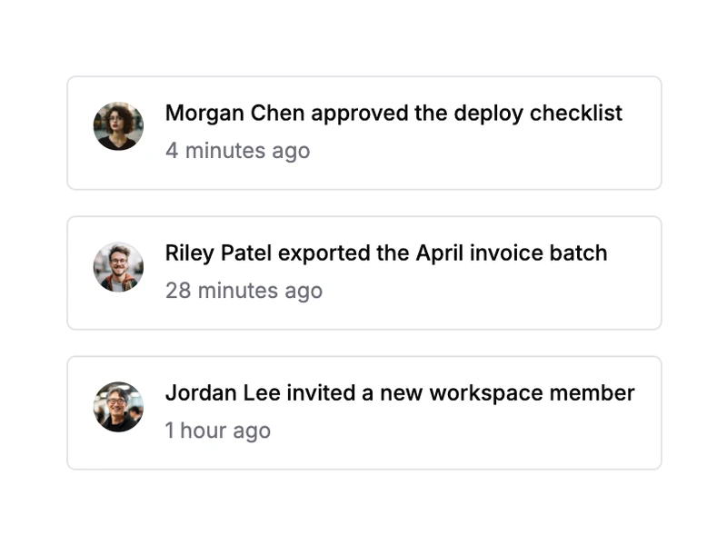
Rows with a secondary meta line such as timestamps or file sizes.

Rows with a trailing Badge for plan or status labels.

Rows with a colored dot indicator for online or sync state.

Each row includes an icon button in ItemActions.

Single-select list with one highlighted row at a time.

List container showing Empty when no rows are available.

Skeleton placeholder rows while list data is loading.

Long list inside ScrollArea with a fixed max height.

Grouped list with section labels above each ItemGroup.

Scrollable list with sticky section labels while scrolling.

Search input filters visible rows in the list.

List rows using the muted Item variant for subdued entries.

Rows with ItemHeader above the main content block.

Compact navigation rows with a trailing chevron indicator.

Filterable panel with a dedicated empty state when nothing matches.

Placeholder skeleton rows shaped like list items while loading.

Scrollable list with a footer button to load additional rows.

Dense list panel using the xs Item size variant.

Panel with a sticky back navigation header above the list.

Shadcn List Panel Basic Components

Shadcn list panel basic components cover essential list panel patterns and the most common variants — a practical starting set for forms, dashboards, and product UI.

Each component is self-contained React code you can copy and paste into your app. Install the shadcn/ui primitive with the CLI, then customize layout, styling, and behavior to match your product.