Shadcn UI Combobox Examples
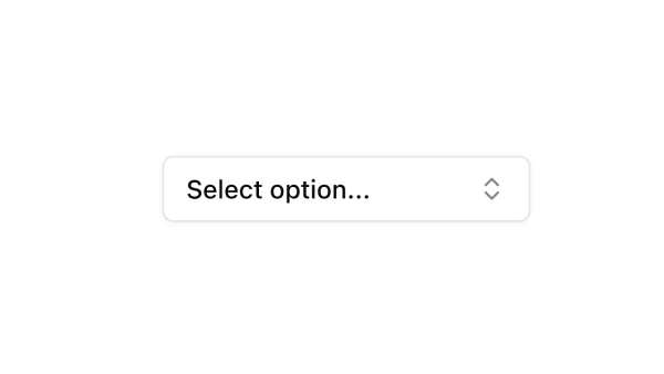
Combobox components combine text input with dropdown selection, allowing users to type to filter options or select from a list. They appear in forms and search interfaces for selecting from large option sets with filtering capabilities.
These blocks show comboboxes with search functionality, keyboard navigation, and various option displays. Examples include comboboxes with icons, comboboxes with grouped options, and comboboxes integrated with form layouts.
Shadcn combobox examples cover the most common patterns: searchable select inputs, filtered dropdowns, and comboboxes with custom option rendering. Browse our blocks to find the configuration you need.
