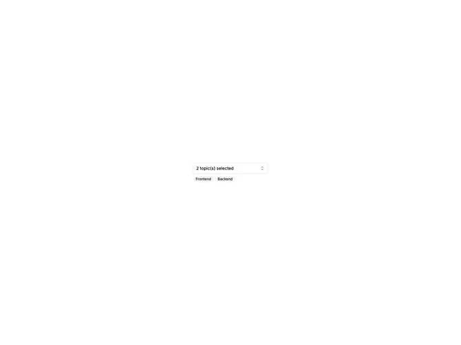

Combobox Multi Select 7 component design & features
This example implements a shadcn combobox using Popover, Command, and Button with multi-select support where chosen items appear as removable badges or a count in the trigger. Users search and select from a filterable dropdown list.
Multi-select comboboxes appear in tag pickers, category filters, and team member assignment where several options can be active at once.