Shadcn UI Calendar Examples
Calendar components display date selection interfaces with month and year navigation. They appear in forms, date pickers, and scheduling interfaces for selecting single dates, date ranges, or multiple dates.
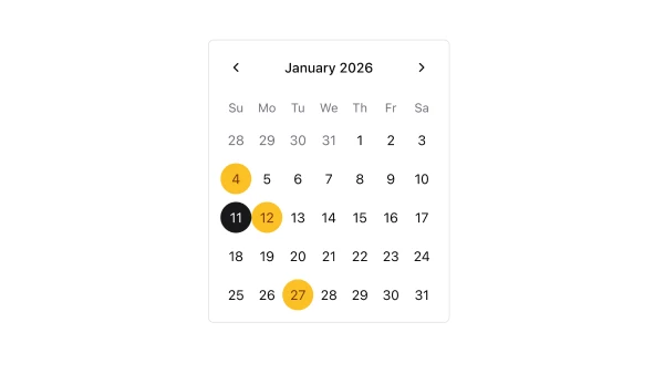
These blocks show calendars with various configurations including single date selection, date range selection, and multiple date selection. Examples include calendars with disabled dates, calendars with custom styling, and calendars integrated with date picker inputs.
Shadcn calendar examples cover the most common patterns: single date selection, date range selection, and calendar displays with custom styling. Browse our blocks to find the configuration you need.
