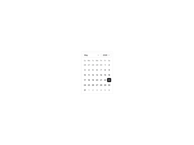

Calendar Standard 2 component design & features
This example uses the shadcn Calendar component in single-date selection mode. Month and year navigation uses captionLayout dropdown with Select components for quick jumping. The disabled prop blocks date ranges, weekends, and specific dates from selection.
Inline calendar examples fit booking pages, scheduling widgets, and date filter panels where the picker remains visible alongside related controls.