Shadcn Button Group Components

Browse and download 39+ Shadcn UI Button Group components. Built with React, Tailwind and shadcn/ui. These shadcn components are ready to download, copy and paste or install with the shadcn registry.

Playback Speed grouped for media playback or zoom controls.

Loading States pattern with grouped toolbar actions.

Density Controls controls grouped as a connected button strip.

Comment Actions buttons grouped with optional icon-only variants.

Action buttons with inline badge counts.

Contextual Toolbar pattern with grouped toolbar actions.

Sort Controls with active state toggling between grouped buttons.

Action buttons with inline badge counts.

Social Actions buttons grouped with optional icon-only variants.

Map Controls controls grouped as a connected button strip.

Button groups showing outline, secondary, and destructive variants.

Date Selector as a toggle-style button group for form input.

Keyboard Shortcuts pattern with grouped toolbar actions.

Vertical button group with stacked outline buttons.

Action buttons with inline badge counts.

Chart Controls controls grouped as a connected button strip.

Player Controls grouped for media playback or zoom controls.

Bulk Actions buttons grouped with optional icon-only variants.

Wizard Steps with connected prev, next, and step buttons.

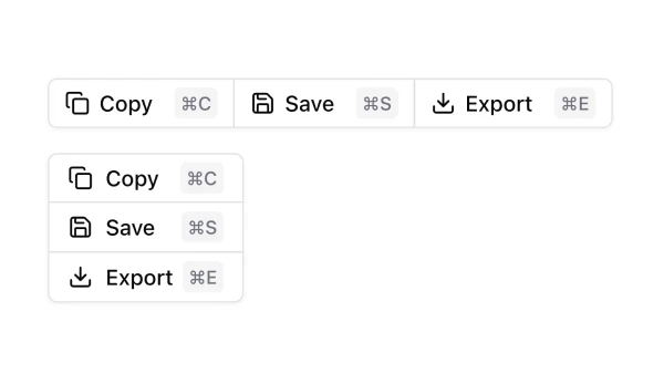
File Operations buttons grouped with optional icon-only variants.

Filter Chips with active state toggling between grouped buttons.

Segmented Control with active state toggling between grouped buttons.

Carousel Controls with connected prev, next, and step buttons.

Stepper button group with increment and decrement controls.

Timeline Controls controls grouped as a connected button strip.

Volume Controls grouped for media playback or zoom controls.

Status Selector as a toggle-style button group for form input.

View Switcher with active state toggling between grouped buttons.

Horizontal button groups at default, small, and large sizes.

Action buttons with inline badge counts.

Priority Selector as a toggle-style button group for form input.

Zoom Controls grouped for media playback or zoom controls.

Rich text formatting toolbar built as button groups.

Quantity Picker as a toggle-style button group for form input.

Pagination with connected prev, next, and step buttons.

Primary actions in a group with overflow dropdown menu.

Button group combining Select prefix with text suffix.

Split button with primary action and dropdown menu.

Nested button groups at multiple sizes.

Shadcn UI Button Group Components

Shadcn button group components are reusable UI primitives from shadcn/ui. Browse ready-to-use components showing variants, states, and compositions you can drop into forms, dashboards, and marketing pages.

Each component is self-contained React code you can copy and paste into your app. Install the shadcn/ui primitive with the CLI, then customize layout, styling, and behavior to match your product.

The collection covers default and variant styles, sizing, disabled states, form integration, and compositions with related shadcn/ui primitives — plus practical examples and UI patterns for common button group use cases. Each component is built with React, Tailwind CSS, and accessible Radix UI or Base UI.

Frequently Asked Questions

How are Shadcnblocks button group components built?
Shadcnblocks button group components are built with React, Tailwind CSS, and shadcn/ui primitives.

What technologies are used to build Shadcnblocks button group components?
Each component uses standard React, Tailwind utility classes, and shadcn/ui primitives from the official registry.

What frameworks do Shadcnblocks button group components work with?
Shadcnblocks button group components work with any React-based framework including Next.js, Remix, Astro, and Vite.

Can I customize Shadcnblocks button group components?
Yes. Every component is source code you add directly to your project. You can modify markup, styling, and behavior using standard React and Tailwind.

Do Shadcnblocks button group components support dark mode?
Yes. Components use shadcn/ui’s theming system and support light and dark mode out of the box.

How do I install the button group component?
Install the base shadcn/ui component with the CLI: npx shadcn add button-group. Then copy any Shadcnblocks button group component you need from the library.

Can I copy and paste the code into my project?
Yes. Open any component page and use the code tab to copy the full source into your project.