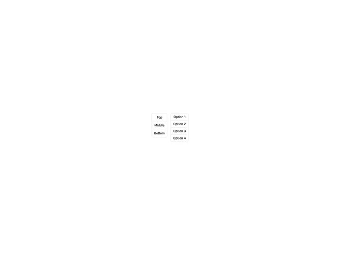

Button Group Standard 2 component design & features
This example uses the shadcn ButtonGroup with vertical orientation, stacking buttons in a column instead of the default horizontal row. Outline variant buttons maintain connected borders between adjacent items.
Vertical button groups fit sidebar toolbars, narrow panels, or mobile layouts where horizontal space is limited, such as map controls or rail-style navigation.