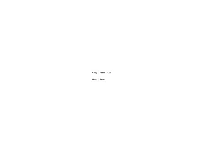

Button Group Standard 3 component design & features
This example demonstrates the basic shadcn ButtonGroup wrapping multiple outline buttons into a connected set. It shows groups at default, small, and large button sizes with shared borders between adjacent buttons.
Basic button groups suit segmented actions like pagination controls, view toggles, or grouped form actions where related choices should appear as a single unit.