Shadcn UI Alert Examples
Alert components display important messages and notifications to users. They appear throughout interfaces for success confirmations, error warnings, informational notices, and destructive action confirmations.
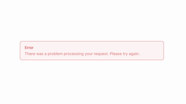
These blocks show alerts in default, destructive, and custom variants with icons, titles, descriptions, and dismiss actions. Examples include alerts with action buttons, inline alerts within forms, and banner-style alerts at the top of pages.
Shadcn alert examples cover the most common patterns: inline form validation messages, page-level notifications, and contextual feedback for user actions. Browse our blocks to find the configuration you need.
