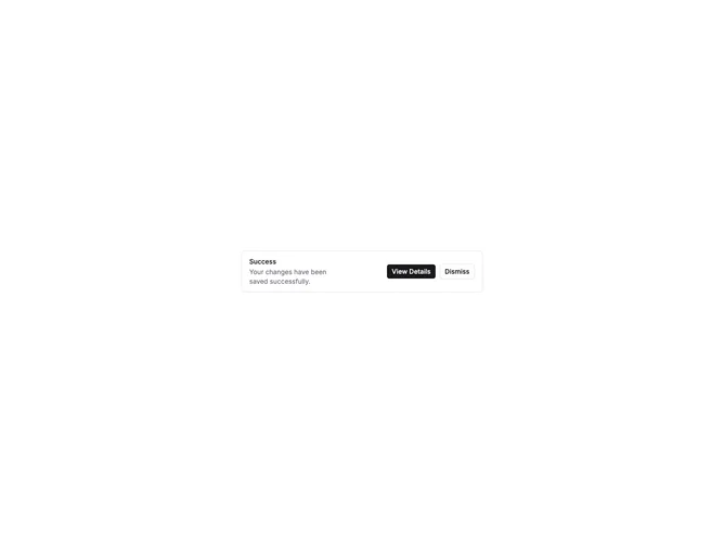

Alert Standard 4 component design & features
This alert combines AlertTitle, AlertDescription, and a row of action buttons. It shows the full content pattern without an icon, using shadcn Alert and Button together.
This layout fits notices that need both explanation and response options, such as policy updates with accept/decline buttons or status messages with follow-up actions.