
Alert Warning 3 component design & features
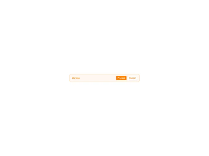
This alert pairs an AlertTitle with action buttons in the alert footer using shadcn Button components. No description or icon is included, keeping focus on the headline and available actions.
Action-only alerts work when the title is sufficient and users need quick choices, such as confirming a prompt, viewing details, or dismissing a notice.