Shadcn UI Switch Examples
Switch components toggle between two states, typically for boolean settings or feature toggles. They appear in settings panels, forms, and preference interfaces for enabling or disabling options with a single interaction.
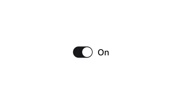
These blocks show switches in checked, unchecked, and disabled states with labels and helper text. Examples include switches with icons, switches integrated with form layouts, and switches with loading states.
Shadcn switch examples cover the most common patterns: settings toggles, feature flags, and preference switches. Browse our blocks to find the configuration you need.
