
Switch Cards 1 component design & features
This example uses the shadcn Switch component to demonstrate settings card. Composed with Label.
Switch cards and lists group related toggles in settings, feature flags, and notification preference panels.
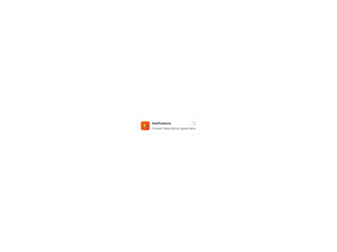
Settings Card.
This example uses the shadcn Switch component to demonstrate settings card. Composed with Label.
Switch cards and lists group related toggles in settings, feature flags, and notification preference panels.