Shadcn UI Sonner Examples
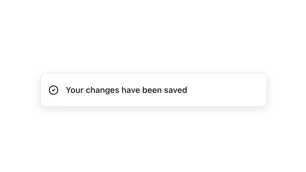
Sonner components display toast notifications that appear temporarily to provide feedback on user actions. They appear throughout interfaces for success messages, error notifications, and informational alerts that don’t require immediate user interaction.
These blocks show toasts with various types like success, error, warning, and info, with action buttons and custom content. Examples include toasts with icons, toasts with descriptions, and toasts with action buttons.
Shadcn sonner examples cover the most common patterns: success notifications, error messages, and informational toasts. Browse our blocks to find the configuration you need.
