Shadcn UI Slider Examples
Slider components allow users to select a value from a range by dragging a handle along a track. They appear in forms, filters, and settings interfaces for selecting numeric values, adjusting volume, or setting preferences within a defined range.
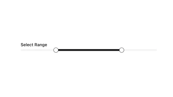
These blocks show sliders with single and range values, step increments, labels, and value displays. Examples include sliders with tooltips showing current values, disabled sliders, and sliders with custom styling.
Shadcn slider examples cover the most common patterns: single-value sliders, range sliders with two handles, and sliders with labels and value displays. Browse our blocks to find the configuration you need.
