Shadcn UI Progress Examples
Progress components display completion status or loading state with a visual indicator. They appear throughout interfaces for file uploads, form completion, loading states, and any scenario requiring visual feedback on progress.
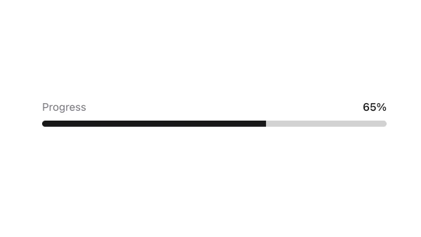
These blocks show progress bars with percentage values, indeterminate loading states, and various styling variants. Examples include progress bars with labels, circular progress indicators, and progress bars integrated with other components.
Shadcn progress examples cover the most common patterns: linear progress bars, circular progress indicators, and progress bars with percentage labels. Browse our blocks to find the configuration you need.
