Shadcn UI Hover Card Examples
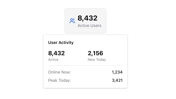
Hover card components display rich content cards that appear when users hover over trigger elements. They appear throughout interfaces for providing additional context, user information, or preview content without navigating away.
These blocks show hover cards with various positioning options, rich content, and styling variants. Examples include hover cards with user profiles, hover cards with product previews, and hover cards with detailed information.
Shadcn hover card examples cover the most common patterns: user profile hover cards, content preview hover cards, and information hover cards. Browse our blocks to find the configuration you need.
