Shadcn Form Components

Browse and download 85+ Shadcn UI Form components. Built with React, Tailwind and shadcn/ui. These shadcn components are ready to download, copy and paste or install with the shadcn registry.

Required Textarea.

Alert dialog with radio group for format selection.

zod email check on Input with invalid address FieldError message.

Alert dialog with validation error state and disabled action.

RadioGroup with Disabled States.

zod schema marking some fields optional alongside required ones.

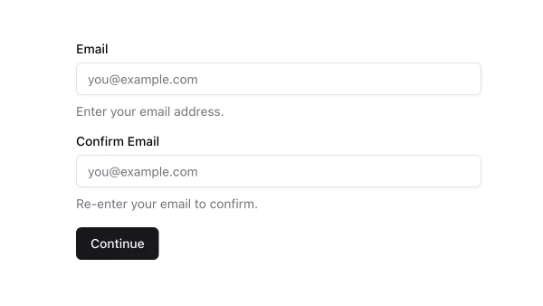
react-hook-form with zod object schema for two Input fields.

zod min length required rules with FieldError on empty submit.

zod regex or refine rules enforcing password complexity requirements.

Alert dialog with checkbox list for notification preferences.

Switch Controller toggling boolean zod field on settings save.

Informational alert dialog displaying system update notice.

react-hook-form Controller wrapping shadcn Select with zod enum.

Form fields using horizontal Field orientation across the row.

Controller-managed Textarea with zod string min and max rules.

Alert dialog with multiple input fields including textarea.

Registration form with name, email, password, and confirm fields.

Form with Sections.

Search and Filter Sheet.

Message textarea with adjacent emoji picker appending symbols on select.

Single schema form mixing Input, Select, Switch, Checkbox, and Textarea.

Three controlled fields sharing one zod schema and submit handler.

zod schema with tailored message strings per rule on each field.

Tight vertical spacing form for dense settings or side panels.

Informational dialog with status badge in header.

Multi-Step Form Sheet.

Textarea with Character Count.

Tooltip - Label Formatter pattern using the shadcn component with its key configuration options.

Checkout slice with contact, address, and payment-related fields.

Form grid or orientation that adapts between mobile stack and desktop rows.

User Profile Edit Sheet.

Textarea with Helper Text.

Date Selector as a toggle-style button group for form input.

Informational dialog with highlighted feature cards.

Default stacked FieldGroup layout for all form fields.

Informational dialog with cancel and action buttons.

Alert dialog with single text input field.

Mac Control Symbol.

Compact horizontal form with Input and submit Button on one line.

Settings panel form with toggles, selects, and text preferences.

Platform-Aware Shortcut.

Multi-column Form.

Two-column grid of form fields with react-hook-form Controllers.

Mac Option Symbol.

Tooltip - Formatter pattern using the shadcn component with its key configuration options.

Textarea with Error.

Password Input field with zod rules inside a submit form.

RadioGroup Controller for exclusive choice validated by zod enum.

Form divided into spaced sections with legends or separators.

Several Select Controllers each with own zod key in one form.

react-hook-form with zod schema validating a single text Input field.

Status Selector as a toggle-style button group for form input.

Filter form with query Input and Select facets submitting together.

Email and password fields with submit for sign-in flow.

Tel Input form with zod pattern or length validation for phone numbers.

Form using number type Input with zod numeric validation.

Alert dialog with input and select dropdown fields.

Search type Input form submitting query string via react-hook-form.

Priority Selector as a toggle-style button group for form input.

Alert dialog with input field and helper description text.

Contact Form Sheet.

Extended form with numerous Controllers and comprehensive zod schema.

react-hook-form mode onChange or onBlur for live FieldError updates.

Create New Item Sheet.

Quantity Picker as a toggle-style button group for form input.

Form combining Input, Select, Checkbox, and Textarea Controllers.

Mac Command Symbol.

Informational dialog with info icon in header.

zod superRefine or refine rules depending on another field value.

Informational dialog with centered icon and keyboard shortcut.

Profile-oriented form with four fields such as name, username, email, and bio.

zod string min and max length with messages on Textarea or Input.

URL Input with zod url validation in a one-field form.

Boolean Checkbox Controller with zod boolean or literal true required.

Editable profile fields with defaults from react-hook-form defaultValues.

Form with Labels.

Multiple FieldSet or FieldGroup sections in one react-hook-form.

Name, email, subject, and message fields for contact submissions.

Informational dialog with scrollable long content.

Form with email type Input and zod email validation on submit.

Textarea with Hint.

Shadcn UI Form Components

Shadcn form components are reusable UI primitives from shadcn/ui. Browse ready-to-use components showing variants, states, and compositions you can drop into forms, dashboards, and marketing pages.

Each component is self-contained React code you can copy and paste into your app. Install the shadcn/ui primitive with the CLI, then customize layout, styling, and behavior to match your product.

The collection covers default and variant styles, sizing, disabled states, form integration, and compositions with related shadcn/ui primitives — plus practical examples and UI patterns for common form use cases. Each component is built with React, Tailwind CSS, and accessible Radix UI or Base UI.

Frequently Asked Questions

How are Shadcnblocks form components built?
Shadcnblocks form components are built with React, Tailwind CSS, and shadcn/ui primitives.

What technologies are used to build Shadcnblocks form components?
Each component uses standard React, Tailwind utility classes, and shadcn/ui primitives from the official registry.

What frameworks do Shadcnblocks form components work with?
Shadcnblocks form components work with any React-based framework including Next.js, Remix, Astro, and Vite.

Can I customize Shadcnblocks form components?
Yes. Every component is source code you add directly to your project. You can modify markup, styling, and behavior using standard React and Tailwind.

Do Shadcnblocks form components support dark mode?
Yes. Components use shadcn/ui’s theming system and support light and dark mode out of the box.

How do I install the form component?
Install the base shadcn/ui component with the CLI: npx shadcn add form. Then copy any Shadcnblocks form component you need from the library.

Can I copy and paste the code into my project?
Yes. Open any component page and use the code tab to copy the full source into your project.