Shadcn UI Carousel Examples
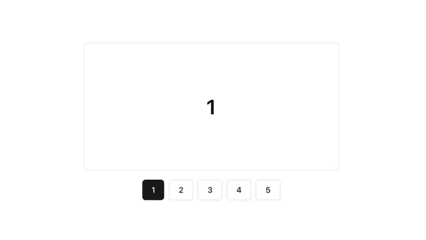
Carousel components display multiple items in a scrollable container with navigation controls. They appear throughout interfaces for image galleries, product showcases, testimonial rotations, and any content that benefits from sequential browsing.
These blocks show carousels with navigation arrows, dot indicators, autoplay functionality, and various item arrangements. Examples include carousels with multiple visible items, carousels with custom navigation, and carousels integrated with other components.
Shadcn carousel examples cover the most common patterns: image carousels, product carousels, and content carousels with navigation controls. Browse our blocks to find the configuration you need.
