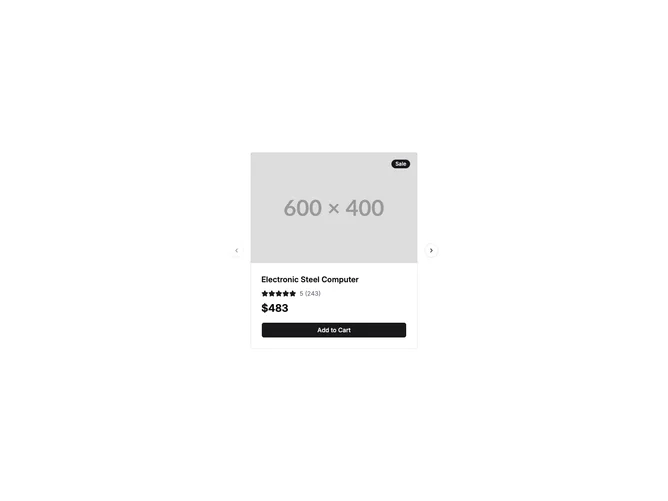

Carousel Standard 3 component design & features
This example builds a product showcase Carousel with CarouselPrevious and CarouselNext controls. Each CarouselItem renders a product card with image, badge, star rating, review count, price, and an Add to Cart button.
Product carousels appear on ecommerce homepages, featured collections, and promotional sections where multiple items rotate within a compact storefront layout.