Shadcn UI Tooltip Examples
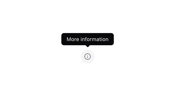
Tooltip components display contextual information when users hover over or focus on elements. They appear throughout interfaces for providing additional context, explaining functionality, and showing helpful hints without cluttering the interface.
These blocks show tooltips with various positioning options, delay settings, and styling variants. Examples include tooltips with rich content, tooltips on disabled elements, and tooltips integrated with icons or buttons.
Shadcn tooltip examples cover the most common patterns: hover tooltips for additional context, focus tooltips for accessibility, and interactive tooltips with action buttons. Browse our blocks to find the configuration you need.
