
Rob Austin - Nov 28, 2025
2,100+ shadcn/ui Component Examples You Can Install with the CLI
Official shadcn/ui gives you the primitive: Button, Table, Sidebar. Shadcn components on shadcnblocks.com are the next layer — 2,100+ examples of those primitives in real layouts. Data tables with filters. Sidebars with teams. Command palettes with pages. You install them the same way you install a block.
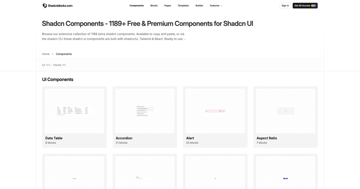
Blocks vs components
| Blocks | Components | |
|---|---|---|
| Job | A marketing or app section | A pattern built on a shadcn primitive |
| Example | Hero, pricing, footer | Table with row actions, inbox list |
| Count | 2,000+ | 2,100+ examples |
| Install | Registry / CLI | Same registry / CLI |
Use a block when you are composing a page or a template. Use a component example when the official shadcn docs show the API and you need a denser UI.
Pages assemble blocks. The Admin Kit is a full dashboard of these patterns already wired. Themes and component styles apply to both catalogs.
Patterns vs components
Hayden Bleasel wrote the official definition of a pattern on components.build: a specific composition of primitives or components that solves a UI/UX problem. Form validation with inline errors. Confirming a destructive action. Typeahead search.
On shadcnblocks.com we use the same split. A component is the reusable unit you already have from shadcn/ui: Button, Table, Dialog. A pattern is very similar, but it imports that underlying component and adds a small amount of structure, or unique props, to create the varied design.
The official button is the component:
import { Button } from "@/components/ui/button"<Button>Button</Button>A loading button is a pattern. Same Button. Extra children, a disabled state, and a spinner:
import { Loader2 } from "lucide-react"import { Button } from "@/components/ui/button"<Button className="gap-2" disabled> <Loader2 className="size-4 animate-spin" /> Loading</Button>You still add button from the official registry. The pattern is the composition you copy from Components. You do not replace the primitive. You do not publish a new LoadingButton package unless you want to. Most teams paste the pattern next to the screens that need it.
That is why the catalog looks like components but behaves like examples. button-standard-1 is the baseline. button-standard-5 is the loading pattern. Icon-only, badge, keyboard shortcut, and async states are the same idea: one primitive, many patterns.
How to install a component example
- Browse Components.
- Copy the command from the example, or ask MCP for “a data table with filters.”
- Follow CLI overview if
components.jsonis not set. - Theme it with Themes or DESIGN.md.
First-time setup is the same as blocks getting started. Base UI works here too.
If the official shadcn docs feel thin once you leave the primitive, open Components. Then keep Blocks and Pages for the marketing chrome around those UIs.
— Rob