
Rob Austin - Jul 25, 2026
DESIGN.md for shadcn/ui Themes: Brand Guidelines AI Agents Can Follow
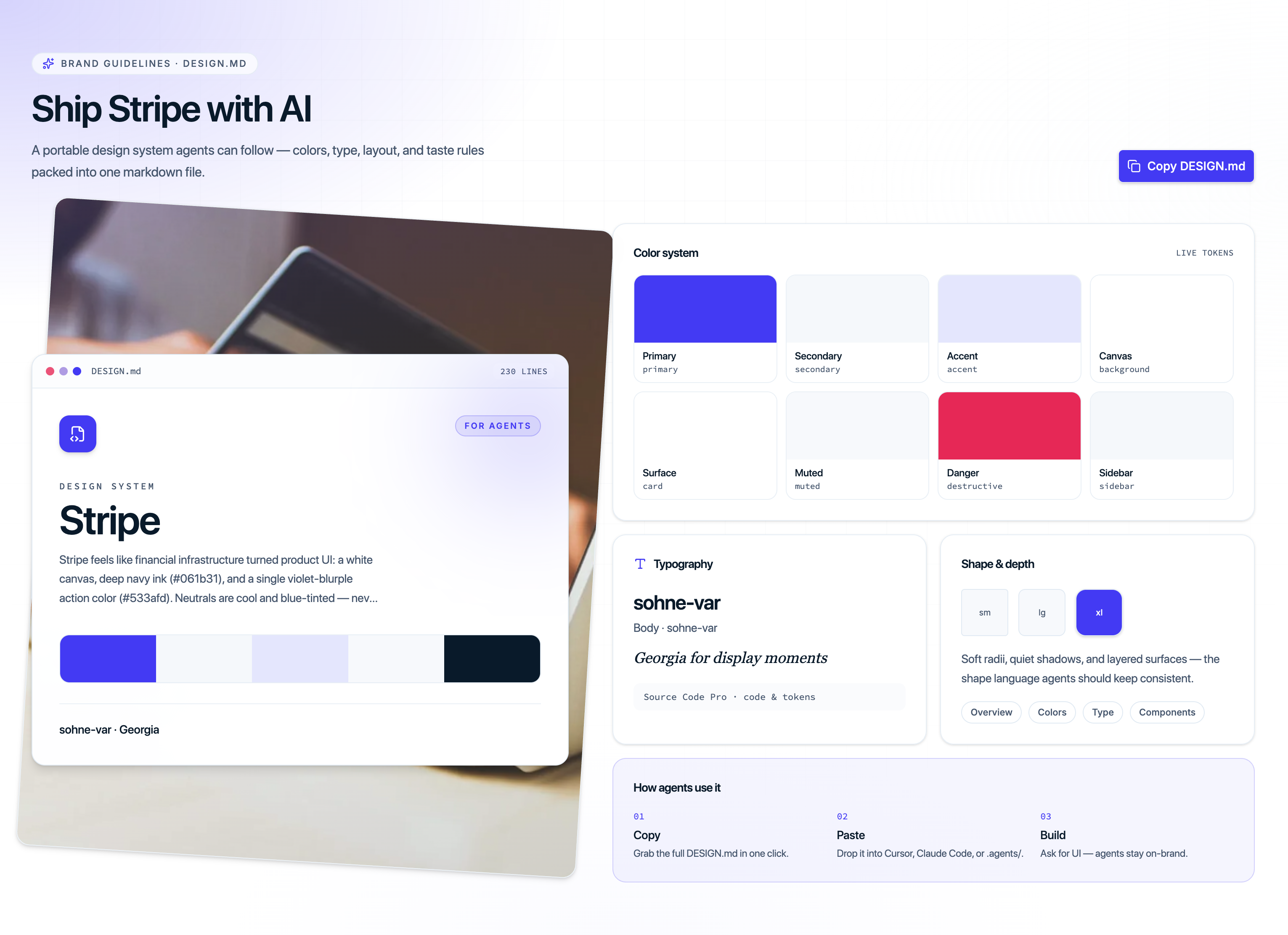
Tokens alone are not enough. When you install a shadcn/ui theme, you get CSS variables for colors, radii, and fonts—but coding agents still guess at hierarchy, density, and taste. That is why every theme on Shadcnblocks now includes a DESIGN.md: a portable design system written for humans and AI.
What is DESIGN.md?
DESIGN.md is a markdown brand brief that lives next to your theme. It describes how the theme should look and feel in product UI—not just which hex values to use. Think of it as the missing half of a theme install:
- CSS variables style the components
- DESIGN.md tells agents how to compose screens with those tokens
You can copy it from any theme detail page (look for Brand guidelines · DESIGN.md) and drop it into your project root or .agents/ folder so Cursor, Claude, and similar tools pick it up automatically.
What each DESIGN.md includes
Every file follows a consistent structure so agents know where to look:
Colors
Primary, secondary, accent, surfaces, sidebar, charts, and destructive tokens—mapped to official shadcn CSS variables. Light and dark pairs are called out explicitly so agents do not invent a zinc-gray dark mode that fights the brand.
Typography
Display, headline, body, label, and mono stacks with size, weight, and tracking guidance. Themes that use a serif for editorial moments (for example Alpine with Playfair Display) document when to use it—and when not to.
Layout and spacing
Base scale, gutters, content max-width, radius tokens, and section pacing. Agents get concrete rhythm rules instead of guessing padding.
Taste rules
The emotional target of the theme: what products it suits, what to avoid, and anti-patterns that break the look (wrong font stacks, overusing accent colors, flattening dark mode).
How to use DESIGN.md with shadcn themes
1. Pick a theme
Browse the shadcn themes gallery. Free options include Vercel, Supabase, Linear, Claude, and more. Pro themes like Alpine and Stripe unlock with a Pro or Premium plan.
2. Install the theme tokens
npx shadcn@latest add @shadcnblocks/theme/alpineThat writes :root and .dark CSS variables into your project—compatible with Tailwind 4 and editors like Tweakcn, StyleGlide, and Tinte.
3. Copy DESIGN.md
On the theme page, open the DESIGN.md section and click Copy DESIGN.md. Paste the file into your repo:
your-app/ DESIGN.md # or .agents/DESIGN.md src/app/globals.css4. Generate UI with agents
Point your agent at the file when you ask for new screens:
Using DESIGN.md and our shadcn theme tokens, build a pricing page with primary CTAs, muted feature cards, and the display font for the hero only.
The agent can now match color roles, type hierarchy, and layout rhythm instead of inventing a generic AI aesthetic.
Why this matters for shadcn/ui + AI workflows
shadcn/ui already won the component layer with copy-paste React and CSS variables. The gap has been taste continuity across AI-generated screens. DESIGN.md closes that gap:
- Same tokens everywhere — themes apply across blocks, components, and pages
- Agent-readable rules — markdown, not a locked Figma file
- One-click copy — no hunting through docs for brand notes
- Editor-friendly — works with Cursor rules, Claude Projects, and any tool that reads repo markdown
Free vs Pro themes
Most DESIGN.md files ship with free themes so you can try the workflow immediately. Alpine and Stripe are Pro themes—their guidelines and tokens unlock with Pro or Premium access, same as the rest of the library.
Start here
- Browse all themes: shadcnblocks.com/themes
- Example Pro theme with a rich DESIGN.md: Alpine
- Example free theme: Vercel
- Related: 13 new shadcn themes announcement
If you are already installing themes via the CLI, add DESIGN.md next—it is the difference between a themed app and a branded one.