
Rob Austin - Jul 25, 2026
13 Free & Premium shadcn/ui Themes You Can Install with One CLI Command
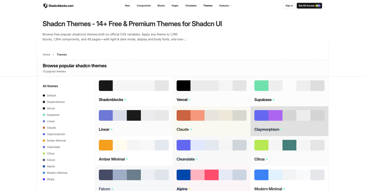
We shipped a curated library of 13 shadcn/ui themes you can browse, preview on real UI, and install with a single command. Every theme uses official shadcn CSS variables—so the same palette drops onto our blocks, components, and pages in light and dark mode.
Why shadcn themes matter
shadcn/ui is built on CSS variables (--primary, --background, --radius, and friends). That means theming is not a fork of every component—it is a token swap. Replace :root and .dark in your stylesheet and the entire UI restyles.
The hard part has been finding production-ready palettes that look good on marketing pages and product chrome, with fonts and dark mode already thought through. That is what this library is for.
What’s in the library
11 free themes
- Shadcnblocks — neutral monochrome default
- Vercel — high-contrast black and white
- Supabase — emerald developer energy
- Linear — product-tool polish
- Claude — warm parchment and terracotta
- Claymorphism — soft dimensional surfaces
- Amber Minimal — warm amber accents
- Cleanslate — clean coastal neutrals
- Citrus — bright green-yellow optimism
- Falcon — sharp bird-of-prey contrast
- Modern Minimal — architectural calm
2 Pro themes
Themes are sourced from editors and generators that export the standard shadcn variable format—including Tweakcn, StyleGlide, Tinte, and our own palette work—so they stay compatible with the wider ecosystem.
How to install a shadcn theme
Open any theme page and copy the CLI command from the toolbar, or run:
npx shadcn@latest add @shadcnblocks/theme/vercelSwap vercel for any theme id (supabase, alpine, claude, …). The registry entry writes theme CSS into your project. Toggle dark mode on the theme detail page to preview both stages before you commit.
Preview themes on real UI
Each theme page is not just a swatch strip. You get:
- Live component previews — buttons, cards, forms, and more in that palette
- Light and dark mode — toggle without leaving the page
- Fonts — display and body stacks loaded with the theme
- DESIGN.md — copyable brand guidelines for AI agents
That last piece matters if you use Cursor or Claude to generate screens: tokens style the components; DESIGN.md tells agents how to compose with them.
Apply themes across the library
Because Shadcnblocks components use the same official variables as shadcn/ui, a theme you install locally also matches what you see in the Explorer and on block detail pages. Pick a palette once; reuse it on:
- Marketing blocks (heroes, pricing, CTAs)
- App UI components
- Full pre-built pages
- Your own Next.js or Vite app via the CLI
Free vs Pro access
Free themes are available to everyone—browse, preview, and install. Alpine and Stripe are Pro themes; unlock them with Pro or Premium (same plans that open the full blocks library).
Start browsing
- Gallery: shadcnblocks.com/themes
- Agent guidelines: DESIGN.md for shadcn themes
- Changelog: 13 Shadcn Themes release
If you have been hand-tuning :root for every project, start from a curated theme instead—then customize the tokens that need to match your brand.