Shadcn UI Contact Pages
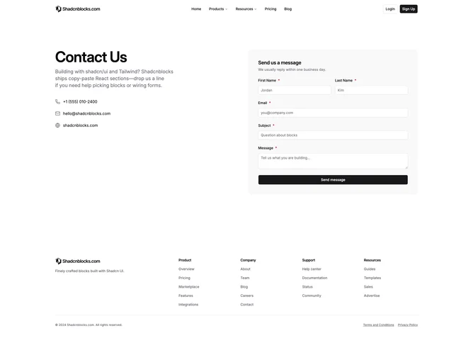
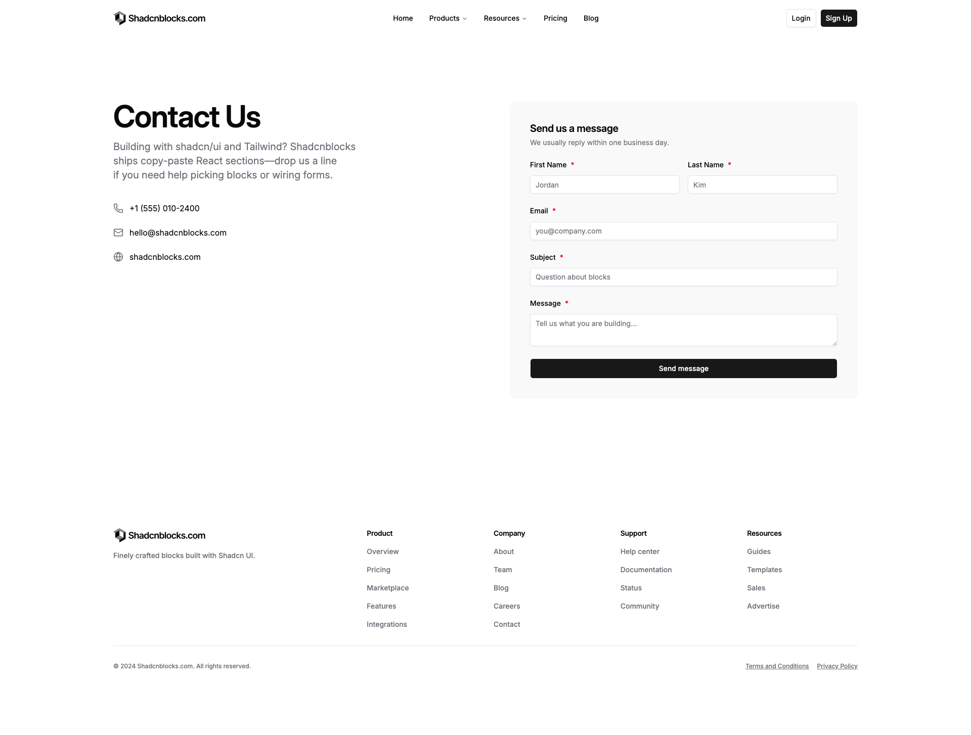
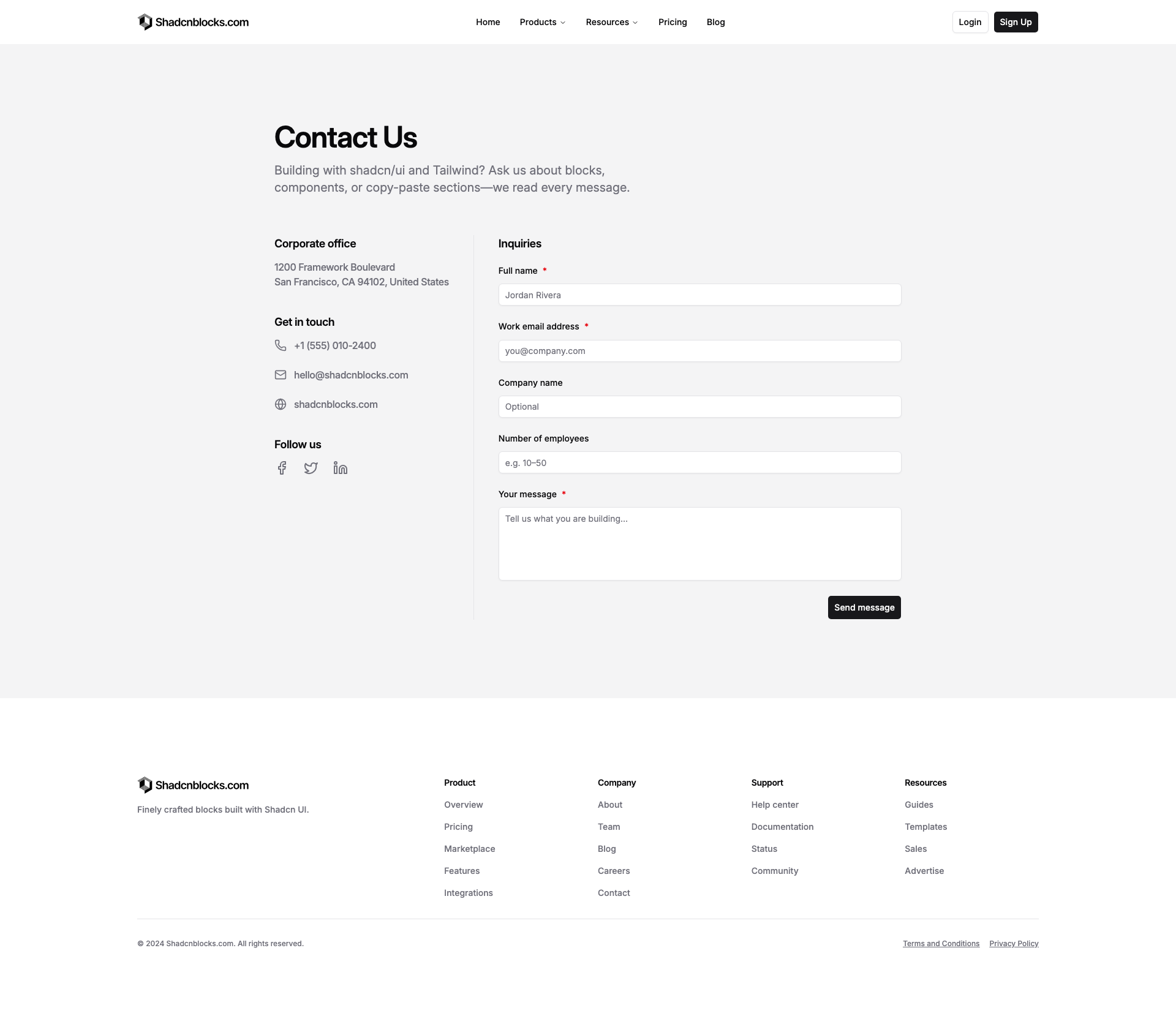
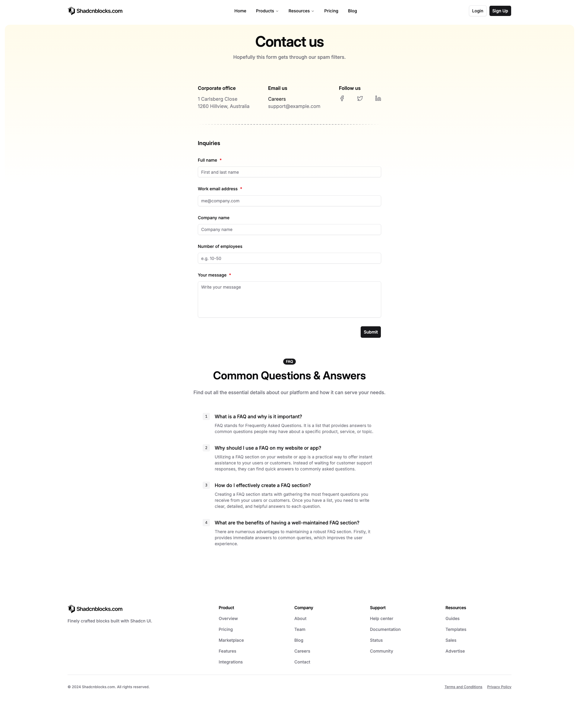
Contact pages are complete page layouts for contact forms, office locations, and support information. Each page combines form sections, maps, team contacts, and FAQs into an accessible design.
Each page is a composition of self-contained React components which you can install via the shadcn CLI. You own the code and can modify however you like.
Frequently Asked Questions
What is a shadcn contact page?
A shadcn contact page is a complete page layout built by combining multiple shadcn/ui blocks into a single cohesive design. Each page includes all the sections you need — navbar, hero, features, testimonials, pricing, CTA, and footer.
How do I install a contact page?
Use the shadcn CLI to install the full page: npx shadcn add @shadcnblocks/page/{pageId}.
Can I customize the contact pages?
Yes. Every page is source code you add directly to your project. You can modify the layout, content, colors, and behavior using standard React and Tailwind patterns.
What frameworks do Shadcnblocks Contact Pages work with?
Shadcnblocks contact pages work with any React-based framework including Next.js, Remix, Astro, and Vite.