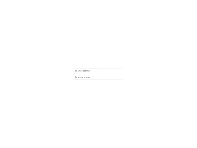

Input Group Icons 2 component design & features
This example uses the shadcn Input Group component to demonstrate contact fields with icons. Uses type="email". InputGroupAddon aligns inline addons with the field.
Leading or trailing icons clarify field purpose in dense forms such as login, contact, or filter rows with many inputs on one line.