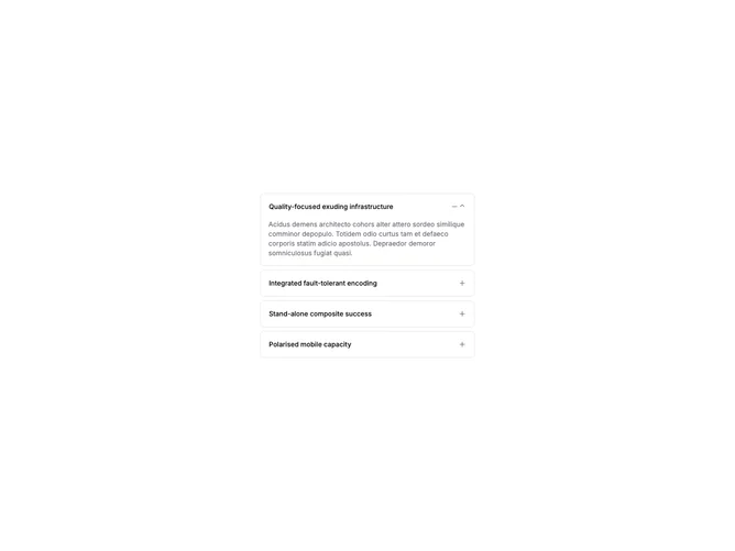

Accordion Tabs 3 component design & features
This accordion renders each item as a separated card with rounded borders and gap spacing instead of a connected stack. Triggers and content follow the tabs-style layout while keeping single-select accordion behavior.
Tab-style accordions suit mobile-friendly layouts and content blocks where each section should read as an independent card rather than a continuous list.