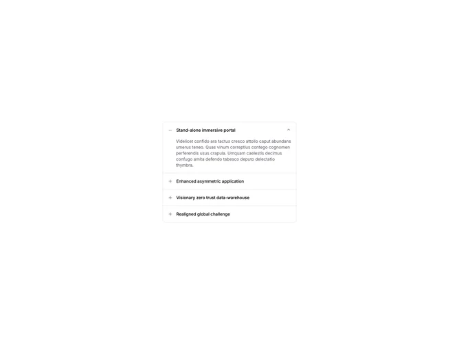

Accordion Standard 4 component design & features
This accordion places plus and minus trigger icons on the left side of each item title. Content is indented to align with the title text when a panel opens.
Left plus triggers fit editorial layouts and help sections where the control sits before the heading, similar to expandable table-of-contents patterns.