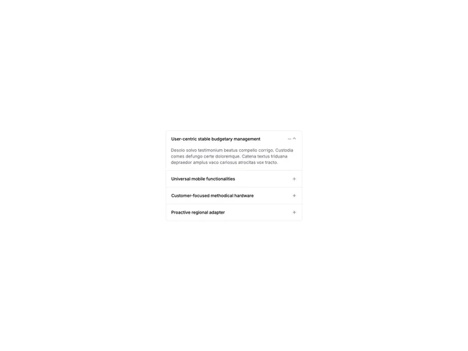

Accordion Standard 3 component design & features
This accordion replaces the default chevron with plus and minus icons that toggle based on open state. It uses type="single" with collapsible behavior so only one section is expanded at a time.
Plus/minus triggers are common in FAQ pages and marketing sites where the expand affordance should feel distinct from navigation chevrons.