
Accordion Standard 2 component design & features
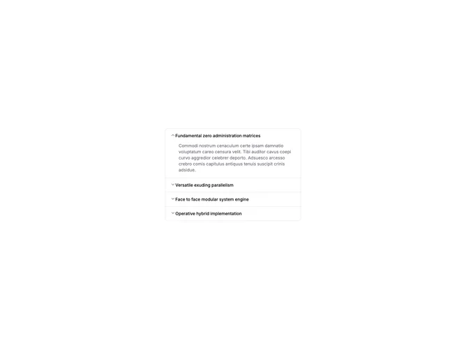
This accordion uses the shadcn Accordion with the chevron trigger repositioned to the left of each item title. Items remain single-select and collapsible with one panel open at a time.
Left-aligned chevrons suit layouts where titles align flush left, such as documentation sidebars, mobile settings screens, or forms where the expand control should precede the label.