
Accordion Standard 1 component design & features
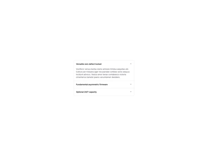
This example uses the shadcn Accordion component built on Radix UI with type="single" and collapsible mode. Three items expand one at a time with the default chevron trigger, and the first item opens by default via defaultValue.
Standard accordions work well for FAQs, product feature lists, and settings panels where users need to scan headings and open only the section they care about.