

Accordion Size 2 - Large

Pro

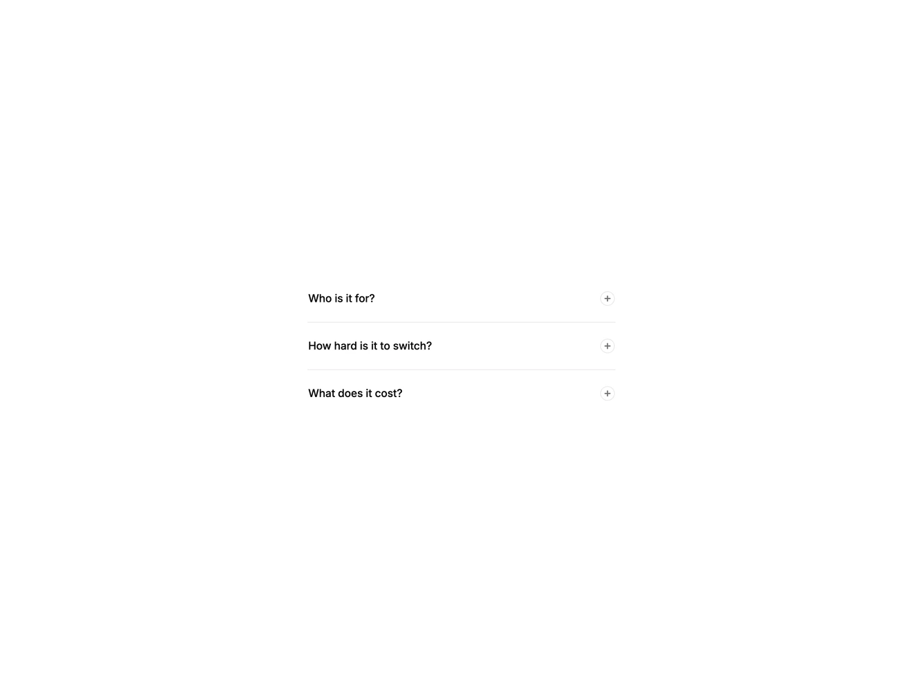
Spacious accordion with large type, generous padding and a circular indicator.

Shadcn Accordion Size 2 component

Component data

ID
accordion/accordion-size-2
Access
pro
Created
Oct 30, 2026
Type
example
Libraries
Radix UI, Base UI, React Aria

Accordion Size 2 component design & features

Triggers use large text and tall padding, and answers use base-size text. The circular indicator fills when an item opens.

Large accordions suit landing-page FAQs and pricing pages where readability matters more than density.