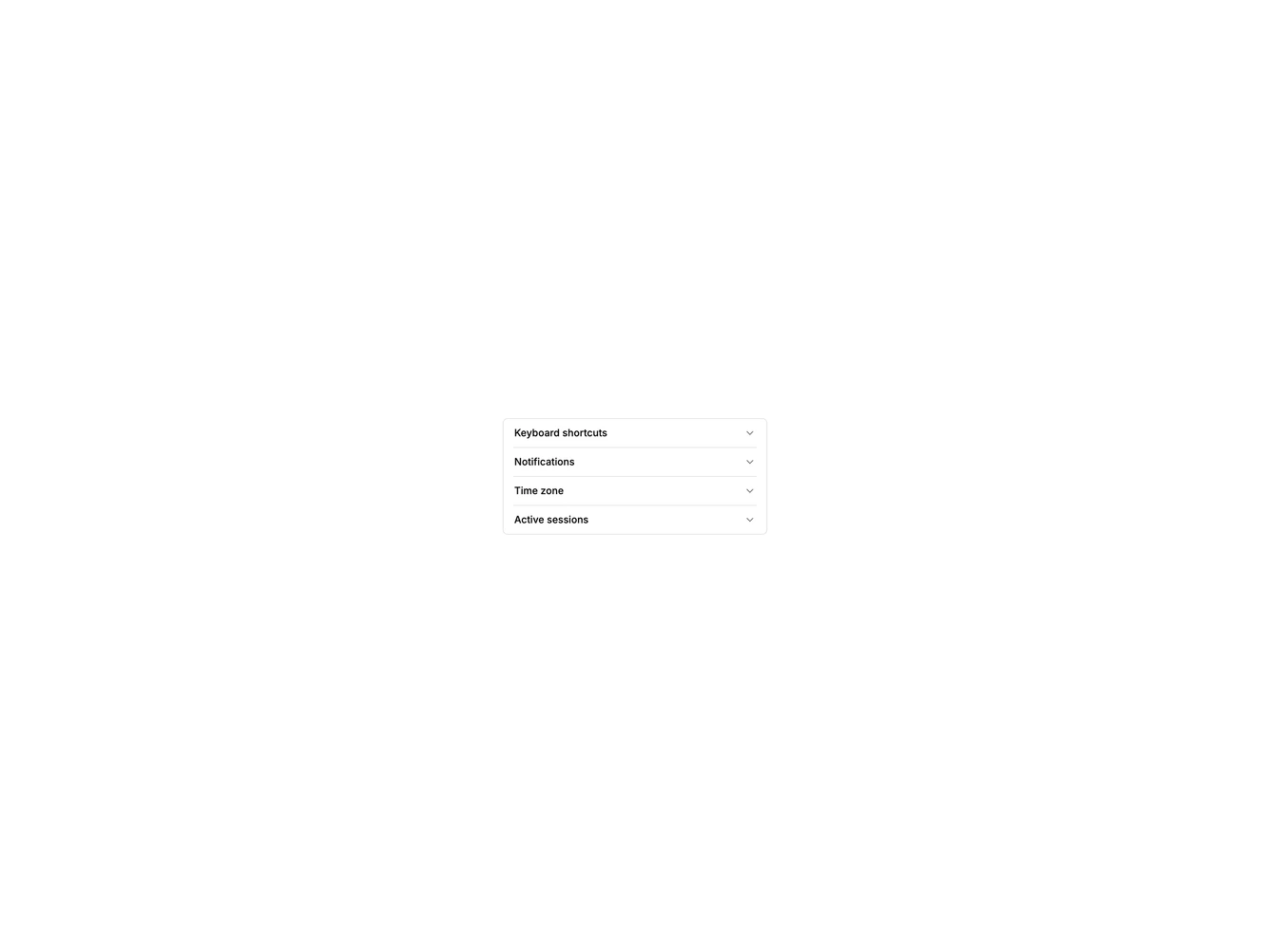


Accordion Size 1 - Compact

Pro

Dense accordion with small text and tight padding for narrow panels.

Shadcn Accordion Size 1 component

Component data

ID
accordion/accordion-size-1
Access
pro
Created
Oct 30, 2026
Type
example
Libraries
Radix UI, Base UI, React Aria

Accordion Size 1 component design & features

Triggers use extra-small text and minimal vertical padding inside a bordered container, with a smaller chevron indicator.

Compact accordions fit inspector panels, popovers and side sheets where space is tight.