

Accordion Media 1 component design & features
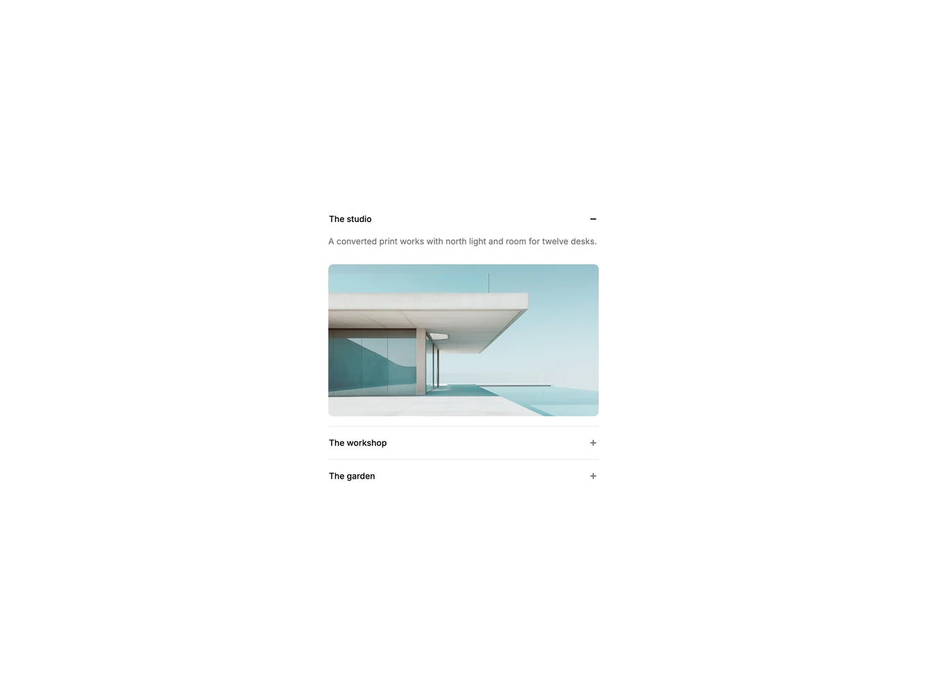
Opening an item reveals a line of copy and a 16:9 image with rounded corners. The image is part of the panel, so it animates open with the text.
Media panels suit space tours, product tours and service lists that pair copy with a photo.