

Accordion Highlight 1 - Highlight

Pro

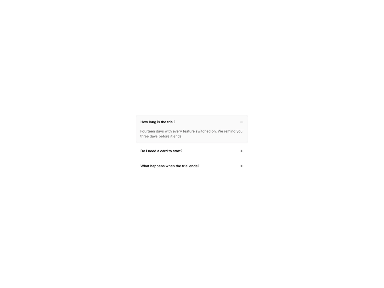
Accordion whose open item gets a border and a tinted background.

Shadcn Accordion Highlight 1 component

Component data

ID
accordion/accordion-highlight-1
Access
pro
Created
Oct 30, 2026
Type
example
Libraries
Radix UI, Base UI, React Aria

Accordion Highlight 1 component design & features

Items have no visible chrome until they open. The open item gains a border and a faint muted fill, which makes the active answer easy to find.

A simple highlight is a good default for FAQ lists that need a clear active state.