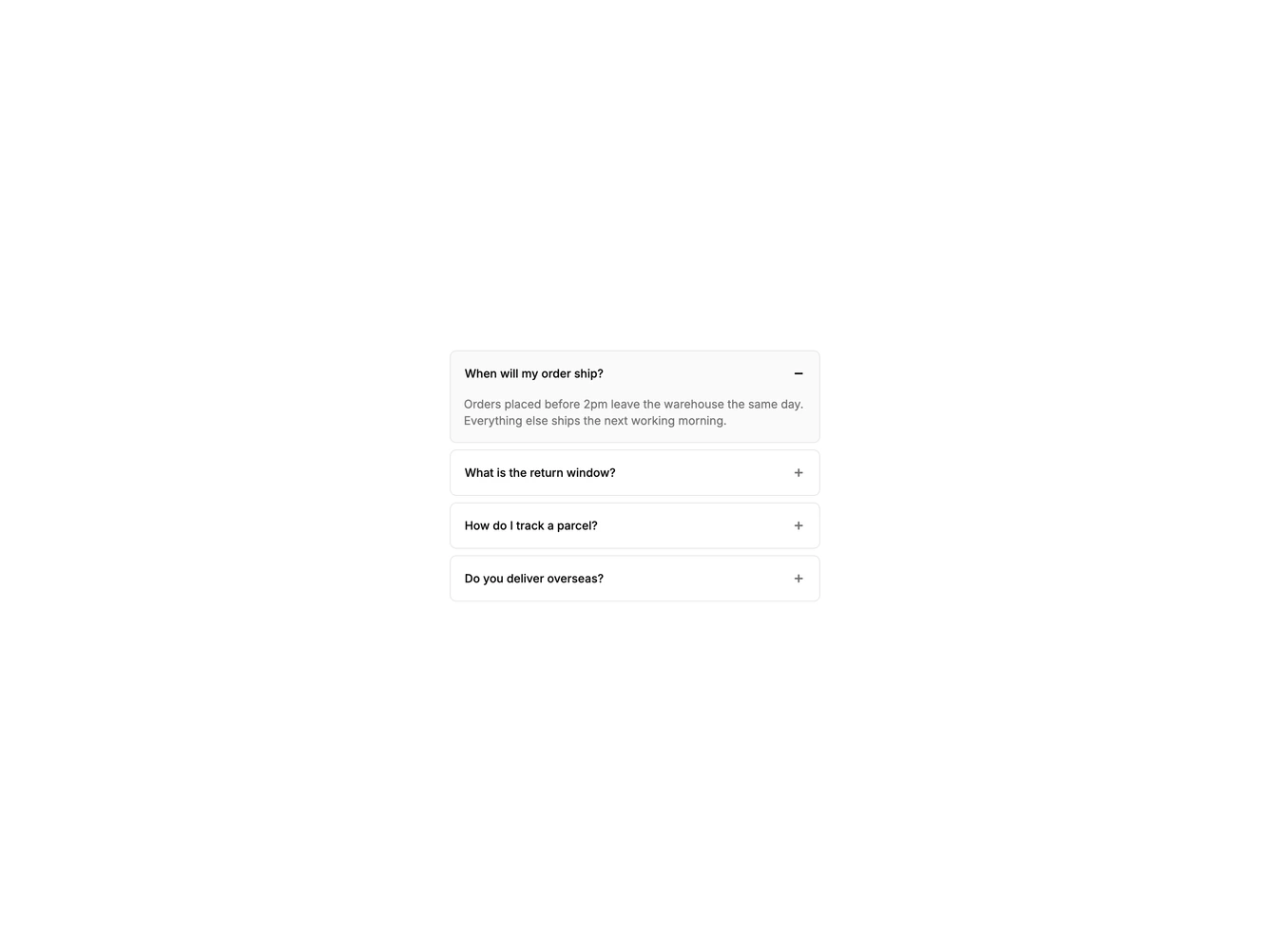


Accordion Card 1 component design & features
Each item sits in its own rounded card with a gap between them, and the open card picks up a muted background. The AccordionIndicator plus collapses its vertical bar to become a minus when the item opens.
Separate cards work well for short FAQ lists in a sidebar or help panel, where each question needs to read as its own unit.