Testimonial 40 block design & features
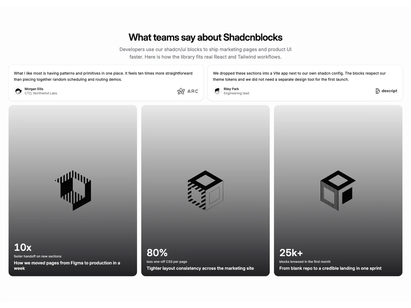
The outer section uses a soft muted page tint and slightly reduced vertical padding. The title and description are centered. Two testimonial cards use white-leaning surfaces with a thin ring border, compact avatars, and right-aligned marks so the pair reads as a small grid of social proof. Below, case studies fill three portrait-aspect links with full-bleed photos, a dark gradient, and light text for numbers and titles anchored to the lower area.
The result feels closer to a lifestyle or editorial case wall than a flat stat grid, while still using the same data shape. Hover scales the image slightly; focus styles stay on the link surface. The block depends on good photography for the case background images.
It is a moderately elaborate Shadcn UI block: same TestimonialCaseStudies props as the subgroup, with emphasis on visual assets. Use it in React or Next.js with the shared placeholder pack or with production copy and art direction.
The testimonial half stays readable on the muted field; the case half prioritizes big numbers and photography over long copy, matching other blocks in this subgroup but with a stronger gallery presence.