Testimonial 39 block design & features
The block opens with a left-aligned title and description. Testimonials are presented in a horizontal scroll region with snap points on narrow viewports, then settle into a two-column grid on larger breakpoints, each in a small bordered card with quote, small avatar, and logo. The pattern keeps thumbs-on-mobile navigation without adding a carousel script. It uses shadcn/ui for avatars and follows the shared subgroup props.
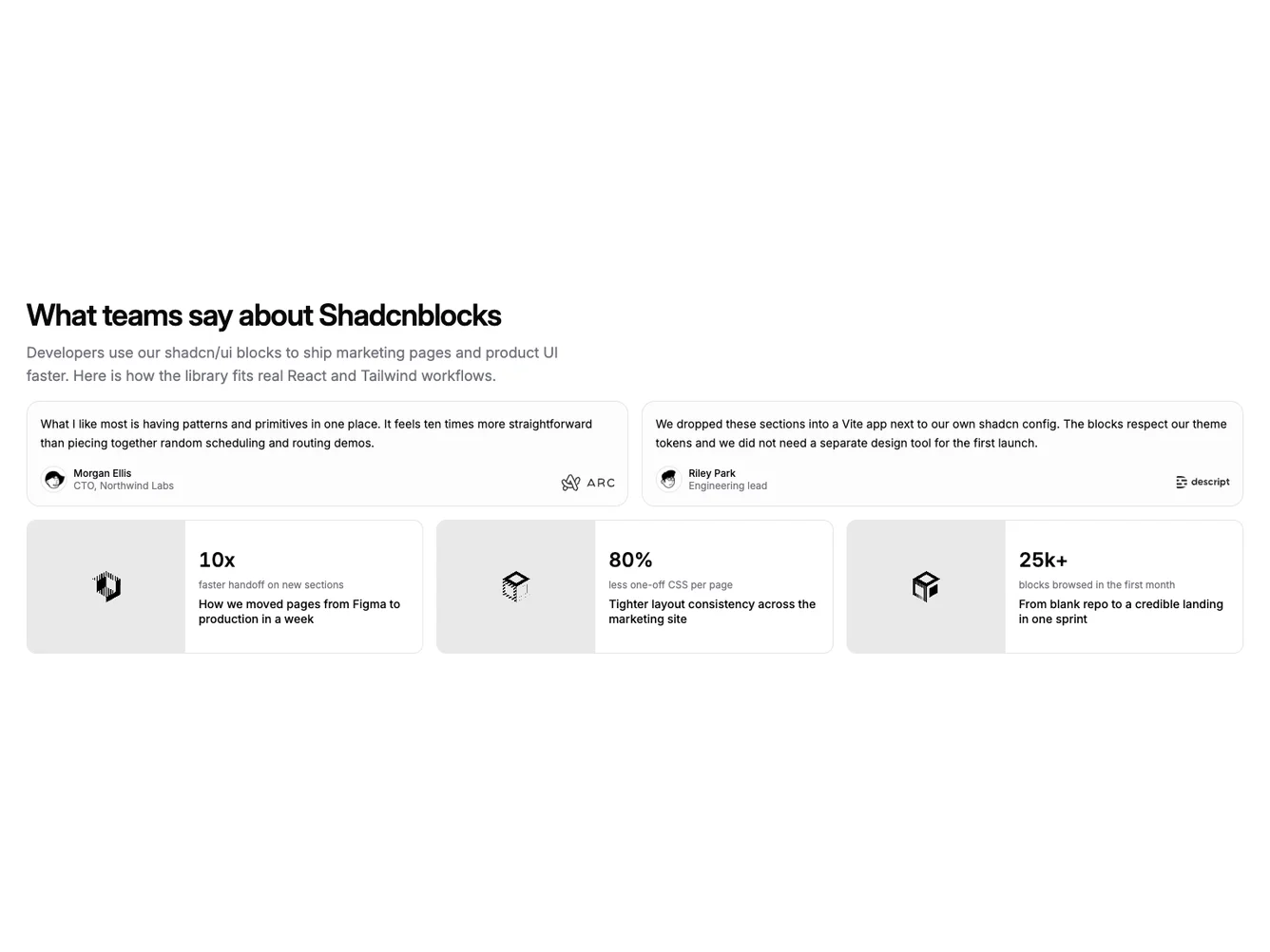
Case studies appear as a vertical stack of wide rows: a fixed-width image strip leads each row, with stats and title in a flex column so the case reads like a product brief. On wide screens the rows sit side by side in a three-column row for balance.
Styling is contemporary and slightly dense: small type for roles, tight logo placement, and strong separation between the scrollable quote area and the case-study band. The block is a moderate-complexity Shadcn UI section for React and Next.js.
You supply the same fields as for testimonial27-style blocks; the layout changes only how the browser lays out the two testimonial items and the three case rows.