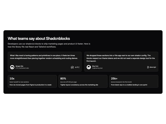
Testimonial 37 block design & features
Content sits inside a full-width rounded panel using the theme foreground as fill and light text for headings and copy. Testimonials get subtle translucent surfaces and hairline borders; company logos are inverted for contrast on the dark field. A row of three case-study links below uses compact stats and short titles, still on the same inverted surface, so the section reads as one continuous band. Shadcn UI avatars sit next to each author name.
The look is assertive: strong contrast, reduced ornament, and a single container edge instead of many floating cards. Hover states lighten the case-study tiles slightly. The pattern fits landing pages that want a bold social-proof strip without a separate light-on-dark hero.
It is a moderate-complexity block: same props as the rest of the subgroup, but developers should check logo assets on dark backgrounds. The block works with the testimonial-case-studies TypeScript contract and the shared placeholder pack in this repo.
This Shadcn UI section can ship in a standard React or Next.js stack; wire headings, testimonials, and case studies from your CMS or from inline props as with sibling blocks in the same subgroup.