Shadcn UI Testimonial Block
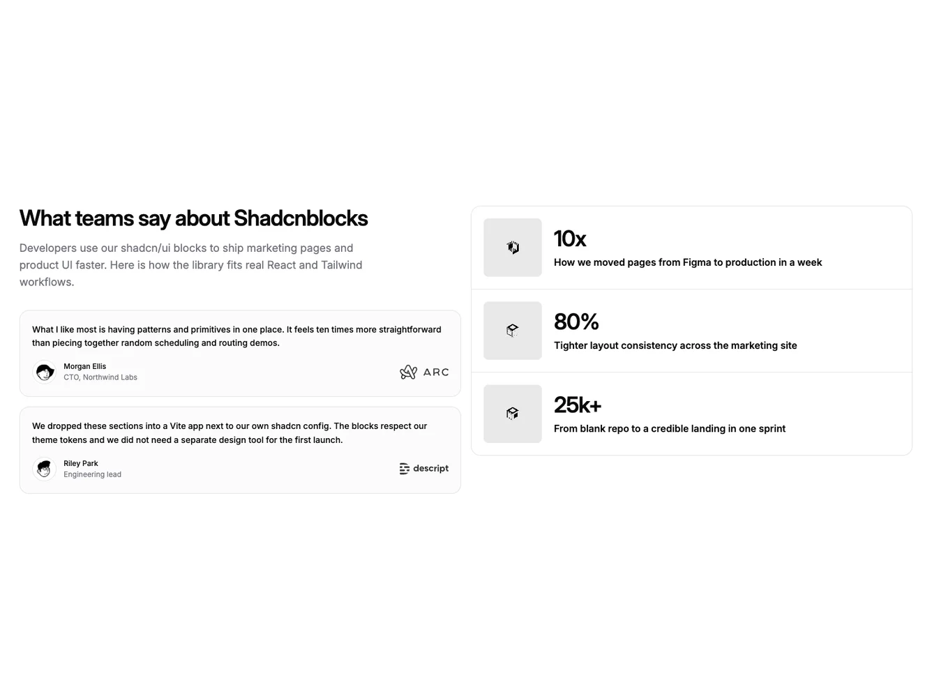
The section uses a wide two-column split on large screens. The left column carries the title, supporting line, and both testimonial blocks in a vertical stack with bordered, lightly filled cards, avatars, and company marks. The right column groups case studies in a single panel with row dividers: each link shows a preview image and the headline stat, label, and title beside it, so the block reads as a balanced list beside the quotes. Built with shadcn/ui avatars, it follows the testimonial-case-studies data model.
Case-study rows behave as clear links with hover on the row; on small screens the image stacks above the text. The layout suits comparison pages where you want stories on one side and proof points read as a compact list without a tall column of separate cards.
Visually the split is asymmetric but balanced: the quote column is text-heavy, the case column pairs numbers with thumbnails in horizontal rows. The stack collapses to a single column on small viewports. This is a moderate-complexity block in the same family as other case-study plus testimonial sections.
The component is intended for React or Next.js apps using the shared testimonial-case-studies types and placeholder content or custom props. It reuses the same author and company fields as other blocks in the subgroup for predictable integration.