Shadcn UI Testimonial Block
The block leads with a left-aligned heading and description, then a two-up grid of testimonial cards. Each card places the company mark first, the quote, and a horizontal author row with a square avatar, so the layout reads more like a press hit than a centered pull quote. It uses shadcn/ui avatars and the testimonial-case-studies prop shape.
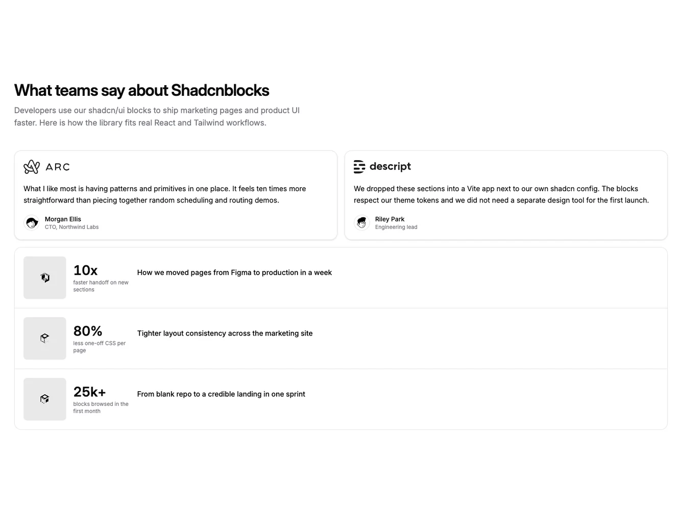
Case studies use one continuous rounded panel: each row is a full-width link with a square thumbnail, a block for the main metric and its label, and the case title. Dividers separate rows, and hover tints the row. Photography stays beside the text instead of a full-card scrim.
The look is product-marketing: logos up front and a scannable case list. The block uses the same data as the rest of the subgroup, including case-study images as small thumbnails. Pair it with the shared TypeScript types and placeholder pack, or with custom copy in a React or Next.js app.