Testimonial 34 block design & features
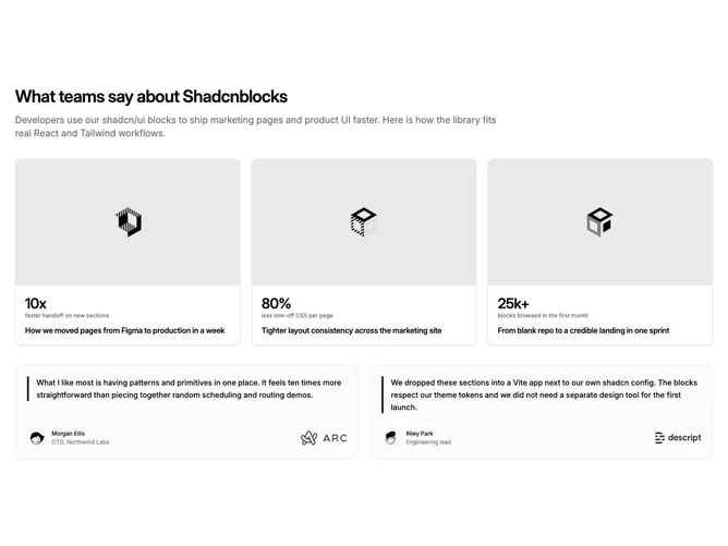
The section leads with a heading and description, then a full-width three-column row of case-study links. Each card shows a cover image in a video aspect window, a large metric with a short label, and a title line, with a light border and card surface so the row reads as a product gallery. Built with shadcn/ui, the layout inverts the usual quote-first pattern: social proof for outcomes appears before the testimonial copy.
The testimonial area sits below in two equal columns. Each block uses a muted panel with a hairline border, a left primary accent bar beside the quote, and a footer row for the author avatar plus a company mark. The quote body sits in medium-weight body text; avatars use rounded-rectangle treatment consistent with the subgroup.
Visually the block separates proof types clearly: photographic case-study cards feel editorial, while the quote cards read as structured pull quotes. Spacing is generous between the two bands so the section does not feel crowded on wide screens. Hover on case cards lifts shadow slightly and scales the image; testimonial cards stay static apart from the border treatment.
The pattern suits marketing pages that want metrics and imagery to land before narrative quotes, while keeping one shared data model for both bands. It is a moderate-complexity block: you need real stats, short labels, a title per case study, background images, two quotes with authors, and logo assets. Compared with a single-column social proof block, it asks for more art direction on the case-study images.
This component is a Shadcn UI section you can drop into a React or Next.js app with props for headings, case studies, and testimonials.