Team 60 block design & features
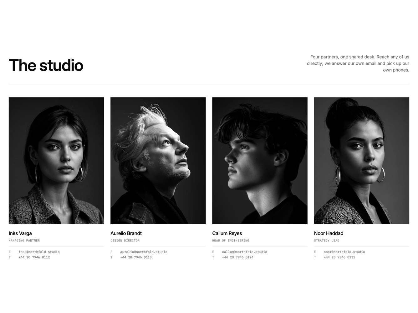
The block opens with a large heading and a short right-aligned paragraph, separated from the roster by a thin rule. Below it, four people sit in a responsive grid of tall 3:4 portraits, each cropped from the top so faces line up across the row.
Every portrait is rendered in greyscale with a touch of extra contrast, which keeps mixed source photos looking like a single shoot. Under each photo is the name, a monospace role in small caps, and a short definition list with email and phone as mailto and tel links.
The monospace contact details give the section a quiet, studio-letterhead feel. It suits agencies, practices and small firms that want people to get in touch with a person rather than a form.
On mobile the grid drops to two columns and then one, and long email addresses truncate instead of overflowing.