
Product Quick View 7 block design & features
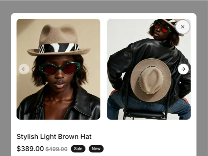
The ProductQuickView7 component serves as a streamlined interface for displaying essential product details at a glance, designed to enhance the browsing experience. This component leverages the Shadcn UI toolkit to create an interactive user interface that combines an aesthetically pleasing layout with functional interactivity. The integration of a dialog box overlay showcases product images, names, prices, badges, and available options like color, size, and quantity. It's designed to help users quickly understand product offerings without leaving their current browsing context.
Delving deeper into its functionality, ProductQuickView7 uses a Shadcn block to enrich its interaction elements, such as carousels for image viewing and forms for option selections. The carousel component provides a seamless way to navigate through multiple product images, enhancing visual appeal and engagement. The form section is particularly noteworthy for its use of radio groups to allow users to select product variations while showcasing stock availability with distinct visual cues. Coupled with an intuitive mechanism for adjusting item quantities, this component stands out by prioritizing user control and customization within a concise user interface, distinguishing it from more static or cumbersome product detail modules.