

Product Quick View 3 block design & features
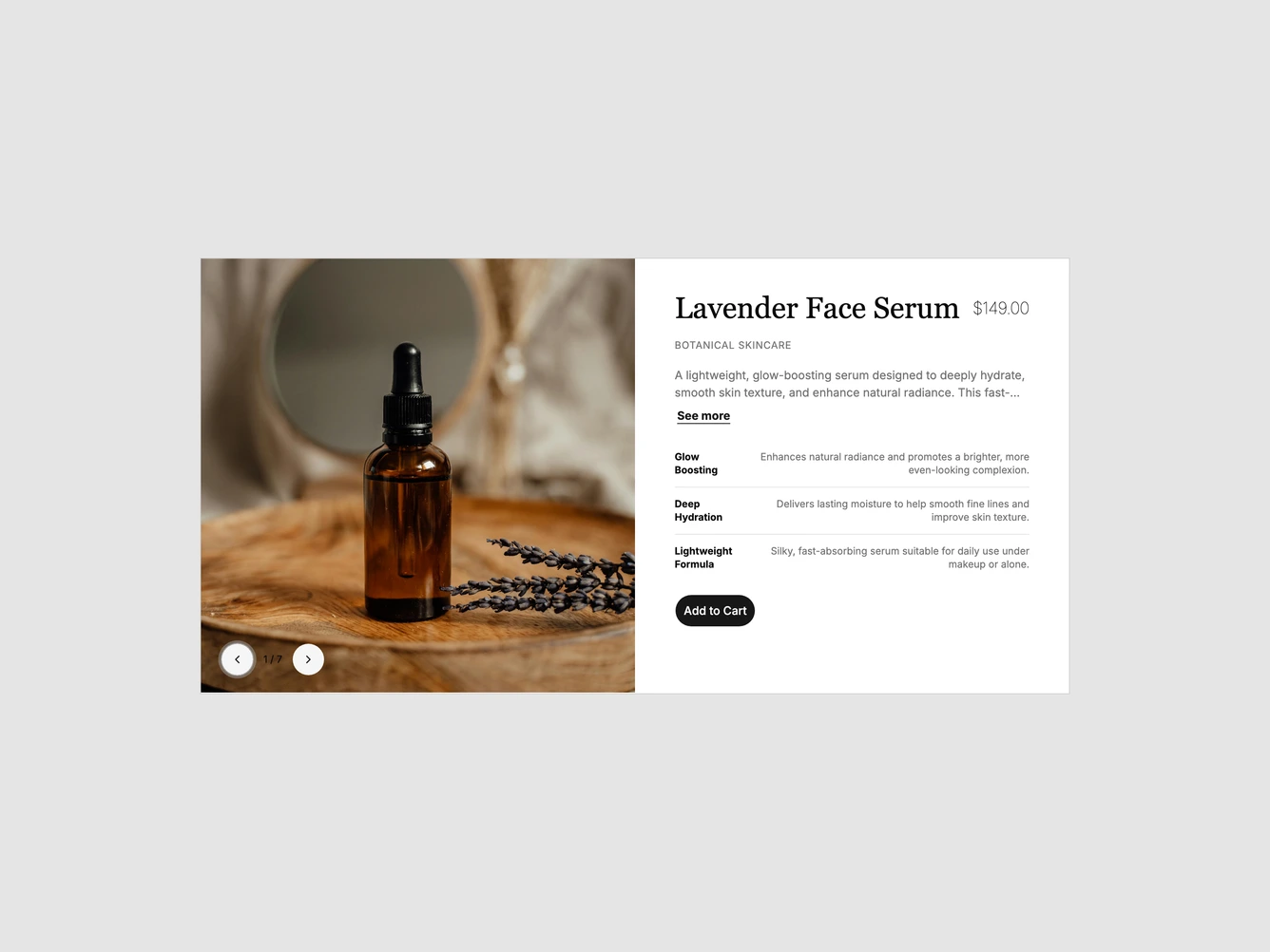
A shadcn/ui quick view dialog for a face serum. The left half is an image carousel with round previous and next buttons and a slide counter in the bottom corner. The right half has a large serif product name with the price aligned to the right, a small uppercase collection label, a two-line description with a See more link, three detail rows divided by hairlines, and a rounded Add to Cart button.
The carousel loops through the product photos, and the counter updates as the slide changes. The description is clamped so the dialog keeps a fixed height on desktop. The name, price, collection, description, details, images and link are props.
On mobile the dialog fills most of the screen and scrolls, with the carousel on top and the details stacked beneath it.