

Product Quick View 12 block design & features
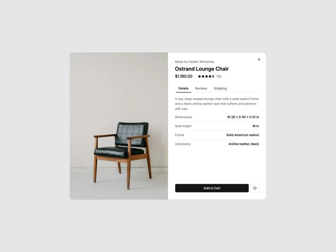
A shadcn/ui quick view that opens as a wide two-column dialog. The left column is a single tall photo of a walnut and leather lounge chair, cropped to fill the full height. The right column has the maker line, a large product name, the price beside a compact star rating with a review count, a row of underlined tabs, and an Add to Cart button with a Save button at the bottom.
The tabs switch between three panels inside a fixed-height area so the dialog doesn't jump. Details shows a short description over a list of dimensions and materials, Reviews shows three short customer reviews with star ratings, and Shipping has a ZIP code field that returns an estimated delivery window in business days, followed by delivery and returns terms. The look is calm and editorial, with thin dividers between rows, a line-style tab bar and no heavy surfaces.
This is a moderately complex quick view that packs a product page's secondary information into a single dialog without making it long. It needs one strong portrait photo plus specs, reviews and shipping terms. The product, photo, rating, specs, reviews, delivery window and terms are props.
On small screens the photo sits above the details as a landscape crop and the whole dialog scrolls.